For the want of a better word is a phrase that is largely concerned with the use of language as a mode of translation, intelligence, excuse, and design. Through the use of this phrase, a person is able to excuse a gap in their vernacular and invite others into the search of ‘a better word’. It also implies that the speaker is admitting that there is, or might be, a better word to be used than the one they have chosen. The phrase could be interpreted as an invitation to problem-solving, thus drawing parallels between the nature of language and design as a means of interpretation, dialogue, and discovery. Over the course of three texts, I will use the lens of the phrase ‘for the want of a better word’ to think and write about the use of synonyms/ thesaurus’, desire and hyperlinks within design practice and methodology. Asking how to find a ‘better word’, what the ‘want’ is and where that search can lead to.
SYNONYMS AND THESAURUS’
For the want of a better word as a phrase in this text is used as a lens from which I will ask how to find the ‘better word’ in design through synonyms and thesaurus-eque thinking.
For the want need wish appetite craving demand fancy hankering hunger longing necessity requirement thirst yearning of a better word. In a fiction piece published by the New Yorker Magazine in 1939, the author Robert M. Coates writes ‘that the English language is one of the richest in the world with more than 550,000 words in its dictionaries and a greater variety of synonyms than any other’. In fact, it is almost impossible to truly say how many words are in the English language at any point in time because it’s so hard to decide what counts as a word, what counts as English, and how to keep an accurate account of what new words are emerging as others become obsolete. In simple terms - it’s easy to get lost in trying to find the better word, but it’s always interesting to search for it and learn about possible replacements.
The way in which we read, interpret and design is shifting towards this idea of a variation on the original, like a synonym we can design for one platform and then tweak, rearrange, or create an alternative version of the same design for another medium. It’s like when you listen to a song and then you listen to a cover version - the words might be the same, but the singer and instruments could have changed and consequently the song seems to mean something different to what you heard in the original. What if we were to think about design in the same way we do synonyms; the cover version of words? What if all design is in some regards an iteration of a single design? Is Arial a synonym of Helvetica? Could there be a thesaurus of interchangeable grid-systems?
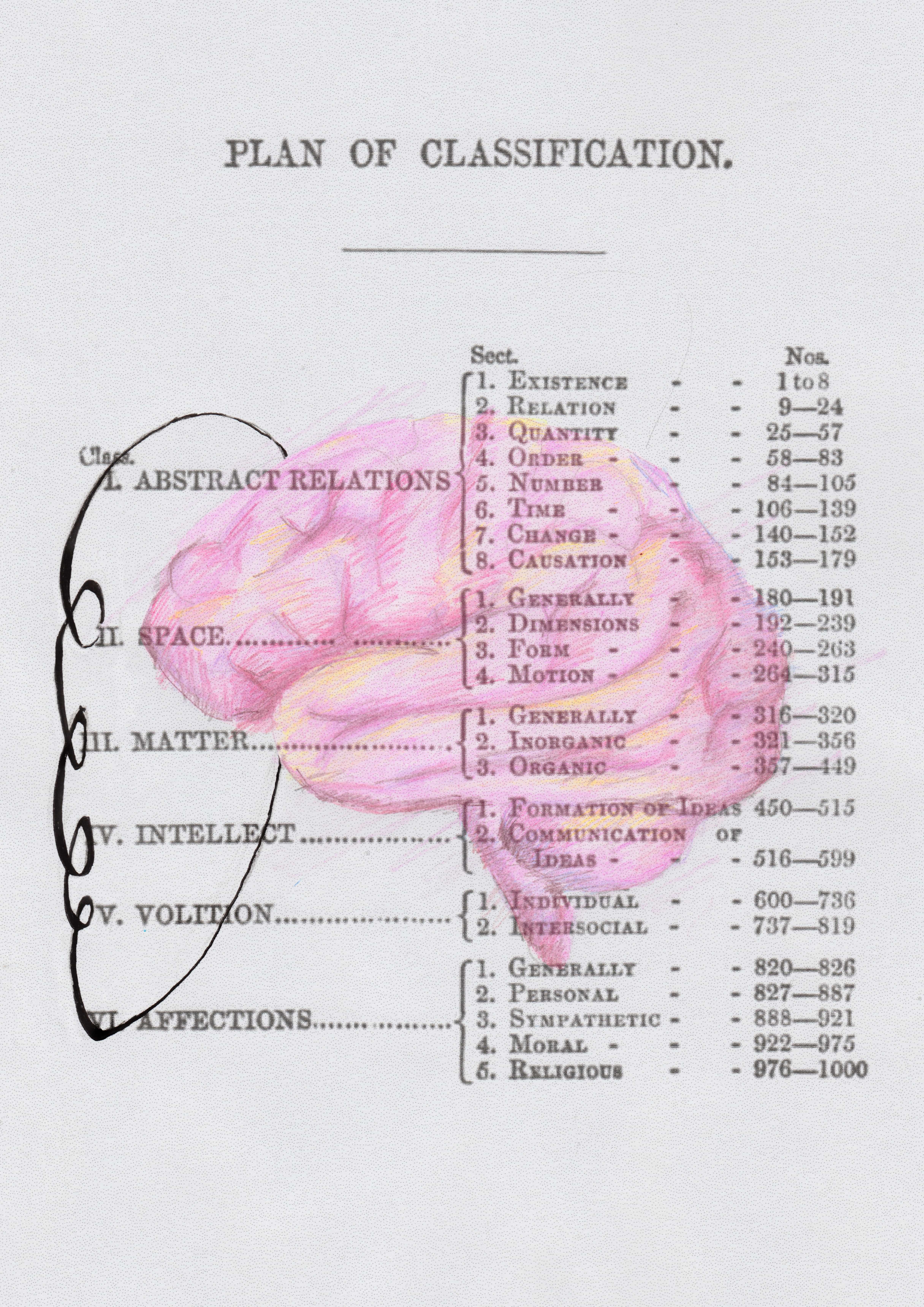
Perhaps one key example of a classification system of words that could be adapted for design is Roget’s Thesaurus. Created in 1805 and still widely used today, it is described by the creator, Peter Mark Roget, as ‘a system of verbal classification’ which includes six primary classes; (1) abstract relations, (2) Space, (3) Matter, (4) Intellect, (5) Volitation, (6) Affections. Each class is then composed of multiple divisions and sections. Roget took inspiration from the way in which naturalist Carl Linnaeus first divided animals into six classes. Is there a way therefore, to classify design into the same or a similar system as the one developed by Roget for his thesaurus (or somewhat reverse dictionary)?
Could you stem design into categories and subsequent divisions or sections? This type of ‘synonym thinking’ is arguably already present within the system of fonts; with online resources such as ‘What the font’ or ‘Fonts in Use’. The website ‘What the Font’ uses deep learning to search a collection of over 133,000 font styles and finds the one that is the ‘best match’, or rather, it tells you which font is nearly the same as the one you are looking at. This website acts like a thesaurus by suggesting alternatives to a selected font from traditional type categories such as ‘serif’, ‘sans serif’, ‘slab serif’, ‘display’ etc. Another example of synonym thinking in fonts can be found via the website ‘Fonts in Use’, used by designers for type selection and pairing, or discovering new ways to use a font. Despite this type of practice being present in font design, there are still discoveries to be made in thinking about the synonyms of exhibitions, digital design, and perhaps even landscaping.
The inclusion of such thinking within various classes of design might help to create a system of thought from which new meaning and tone can be constructed. You could, for example, create a landscape with plants that are all synonyms of one another. Or in the world of cooking where there are alternatives for ingredients - if you don’t have thyme, you can use oregano instead. However, this doesn’t mean the dish will taste the same as intended – it could taste better or worse. Therefore, there is perhaps a risk that synonym thinking could produce a result that is far removed from the original. A result that no longer seems to have a logical systematic connection to that from which it came. Whether this risk is positive or negative is up for debate.
It is at this point that the thinking of Laurence Wiener becomes interesting to assess. As a key figure in the conceptual art scene during the late 1960s, Wiener was amongst the first to suggest that a new relation could be developed between art and the status of the artist. Using language as his primary tool in his work with ‘language + the materials referred to’, he wanted the viewer to develop their own independent experience of what they saw. Wiener is an important artist to look at in the context of design and synonym thinking because his work realizes that language has its own meaning in relation to its surroundings. Therefore, any word, phrase, or font can be interpreted differently if the context around it changes.
I have a cat on my lap.
She took a lap of honour.
They are lapping up the cheering from the crowd.
Likewise, a synonym is an interpretation of the word originally used.
They are lapping up the cheering from the crowd.
They are delighted by the cheering from the crowd.
They are reveling in the cheering from the crowd.
Wiener is choosing to embrace the interpretation of design and promote the viewer, or reader, to come to their own conclusions. He is not searching for a better word, but rather posing it as a question or topic of conversation. It is important here to state that the proposed synonym thinking within design is not to become an excuse or a loophole in the problem of plagiarism. It is not a mode of thinking that promotes the use of a similar font within an existing design or the duplicating and slight tweaking of a design which could lead to depriving the original designer of an income or creative credit. It is about, as in Wiener’s work, opening up the dialogue for alternatives.
Synonym thinking is not lateral, certainly there is some logic to it as shown in the systems of categorisation that Roget created in his thesaurus, but there is also the promise of interpretation, misinterpretation, and contextual influences. Meaning that you could use Arial as a synonym for Helvetica, but to the untrained eye it might look like another sans serif. Or to put it another way, you could decide to use a particular type of cedar wood that in some parts of the world might be thought of as white pine, or interpreted as bamboo in others. In this sense materials, contexts, fonts, and words all have far more forms than that of the actual piece placed in the space or on the page.
Returning to the phrase ‘for the want of a better word’ and this concept of synonym thinking within design, it might be sensible to conclude that the ‘want’ is a result of a feeling of being stuck, of not knowing the ‘better word’, it is a statement of unease leading to searching. Therefore, synonym thinking within design could perhaps not only be about creating a system of ‘counterparts’ but also about an awareness of the search – discovering the counterparts to the material, plant, texture or motion that you thought you first wanted.
As language evolves, so too does design. There are always new counterparts, mediums, trends, and fonts, etc that appear. The system of synonyms is never-ending, it evolves, and parts become redundant. One day we might see books as synonyms for curators or plants as synonyms for textiles. Far removed but interestingly connected, through specific meanings and contexts. Giving the final word to Robert M. Coates, text design ‘still has some curious deficiencies – little blank spots where it fuzzes off into blurred distortions of meaning or occasionally loses sense completely’.